
Role: Founder • Product Strategy • UX Design • AI-Directed Development
Challenge: Design a social app that helps people move from digital discovery to real-world conversation.
Year: 2026-Present
Most social platforms optimize for engagement.
Meex explores the opposite hypothesis:
The best social app might be the one people use the least.
As a solo founder, I developed the product strategy, brand, user experience, and AI-assisted development workflow, directing Claude Code to build a working React Native application from concept to prototype.
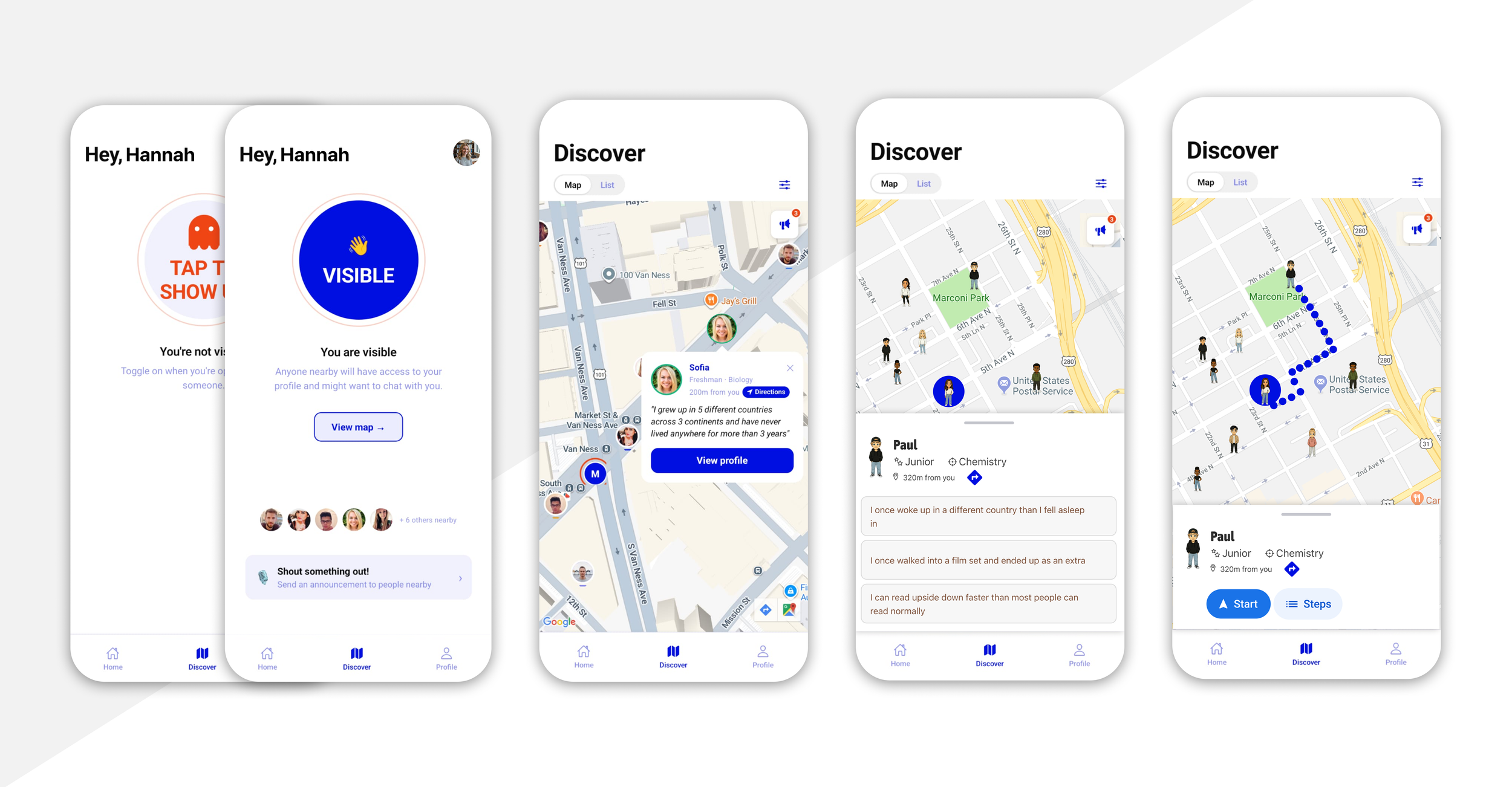
Designing a social app that gets people off their phones and into real-world conversations.
Meex
Situation:
People are surrounded by opportunities for connection, yet initiating conversations with strangers remains uncomfortable and increasingly rare.
Existing social platforms attempt to solve loneliness by keeping users inside feeds, chats, and communities. While these platforms facilitate online interaction, they rarely help people take the final step into real-world connection.
I wanted to explore a different question:
Could technology help people start conversations in person and then disappear?
Constrains:
Solo founder
No engineering support
No funding
No existing user base
Product Principles
Get People Off Their Phones
Technology facilitates connection
Reduce Social Friction
Make approaching easier
Create Confidence
Provide enough context
Disappear Quickly
The app is not the destination
Action:
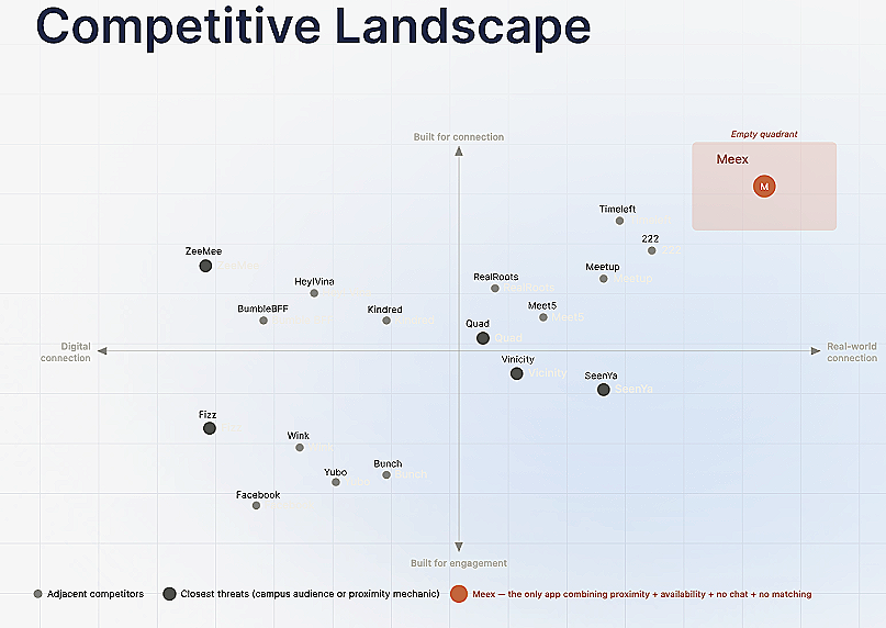
I reframed the problem from building another social network to helping people start one real-world conversation.
As a solo founder, I defined the product strategy, created the brand, designed the end-to-end experience, and developed a closed-loop interaction model that encourages users to meet offline rather than stay in the app.
I used Claude as a thinking partner to explore concepts, challenge assumptions, and accelerate decision-making. To bring the idea to life, I directed Claude Code to build a working React Native prototype, designing and implementing 21 screens across onboarding, discovery, visibility controls, and maps.
When technical constraints emerged around location routing and visualization, I iterated on alternative solutions until the experience could be successfully prototyped.

Result:
Built a functioning 28-screen React Native prototype as a solo founder using AI-directed development.
Defined and validated a differentiated product strategy centered on reducing social friction and encouraging real-world interaction.
Created a complete product ecosystem, including brand, interaction model, onboarding, discovery, and AI-powered conversation support.
Demonstrated how AI can accelerate product development from concept to working software without a traditional engineering team.
Reflection/ What I learned
Simpler interactions drove stronger user interest than feature-rich concepts.
AI accelerated execution, but product judgment remained the critical skill.
Designing for offline outcomes required different success metrics than traditional social apps.