Strategy | UX Design
Verizon Protect app

Year: 2025 - 2025
Role: UX Strategist, UX Designer
Challenge: Verizon needed to evolve key parts of its digital experience to better support tablet users, improve trust and usability in Call Filter, and rethink the homepage as a more personalized, action-driven entry point. The challenge was balancing business priorities, technical constraints, and user needs across multiple surfaces without creating fragmented experiences.
Situation:
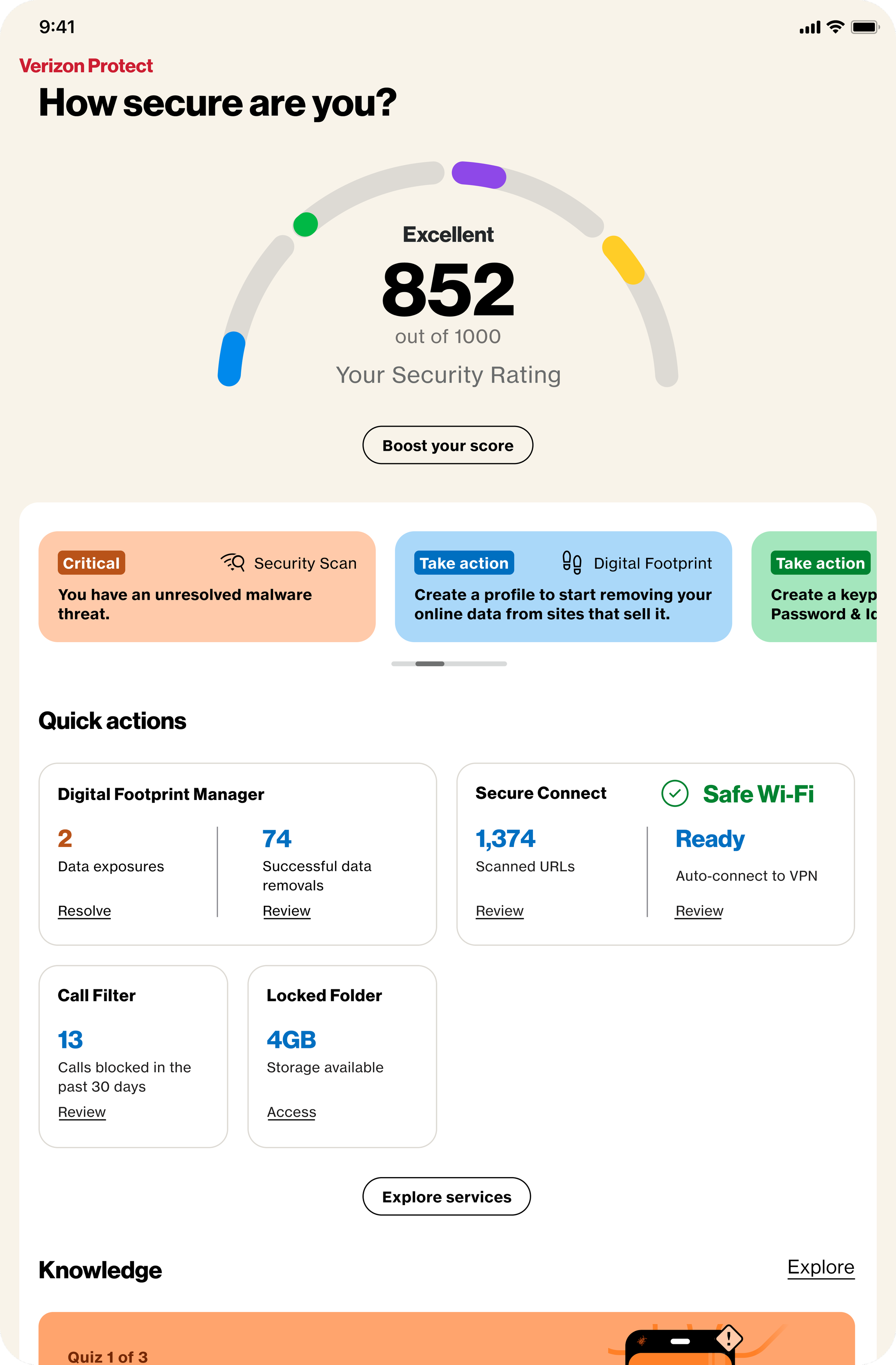
I joined the project at a point where experiences were largely optimized for mobile, with tablet treated as a scaled-up version rather than a distinct use case.
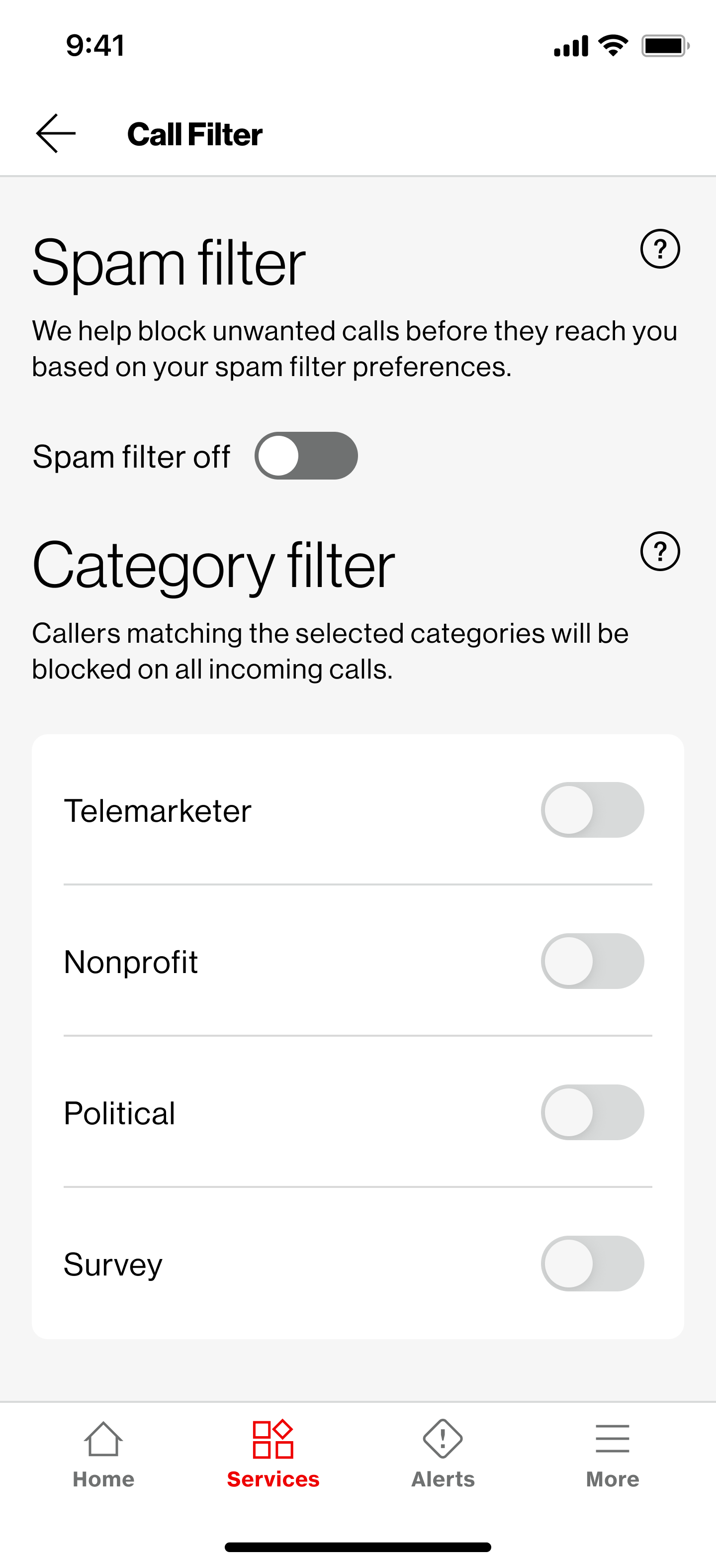
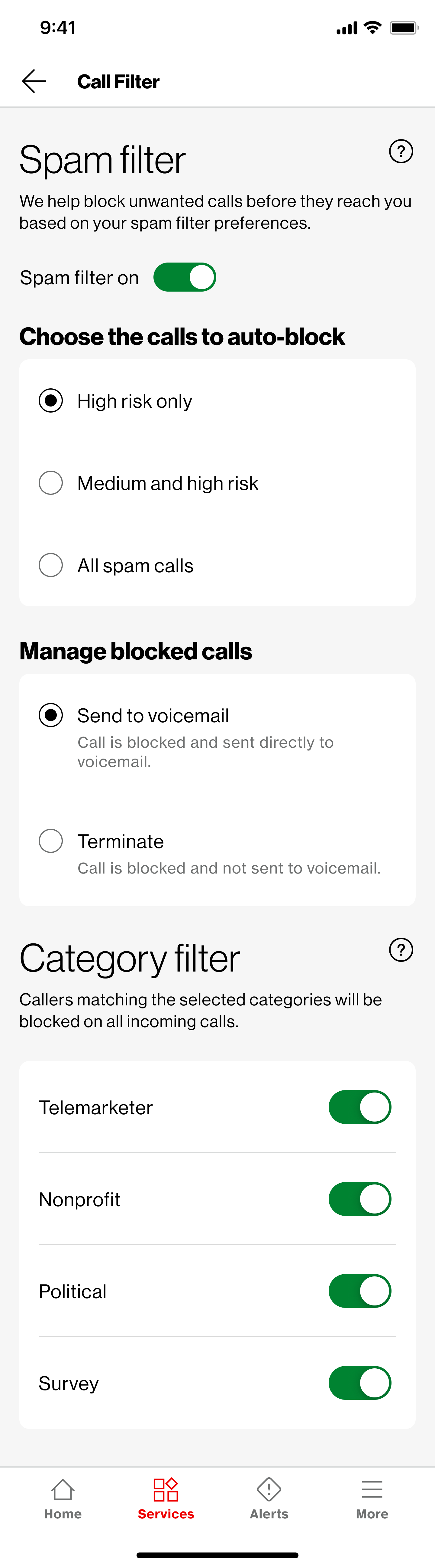
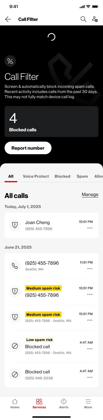
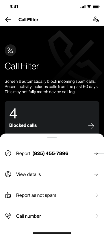
Call Filter, while powerful, suffered from low engagement and unclear value perception. Users did not fully understand what was being blocked, why, or how to control it.
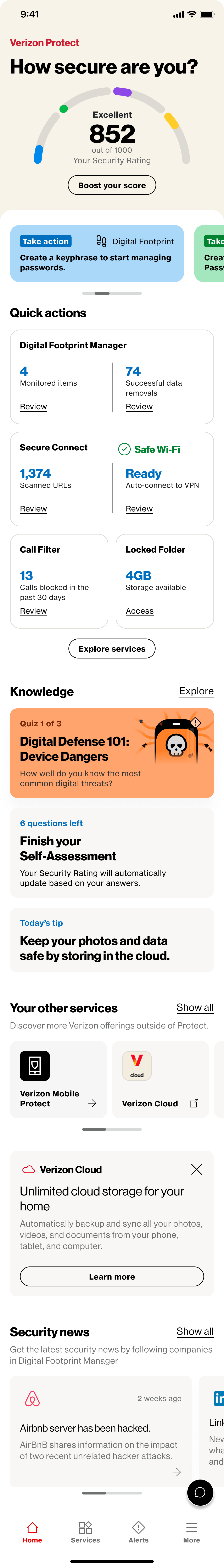
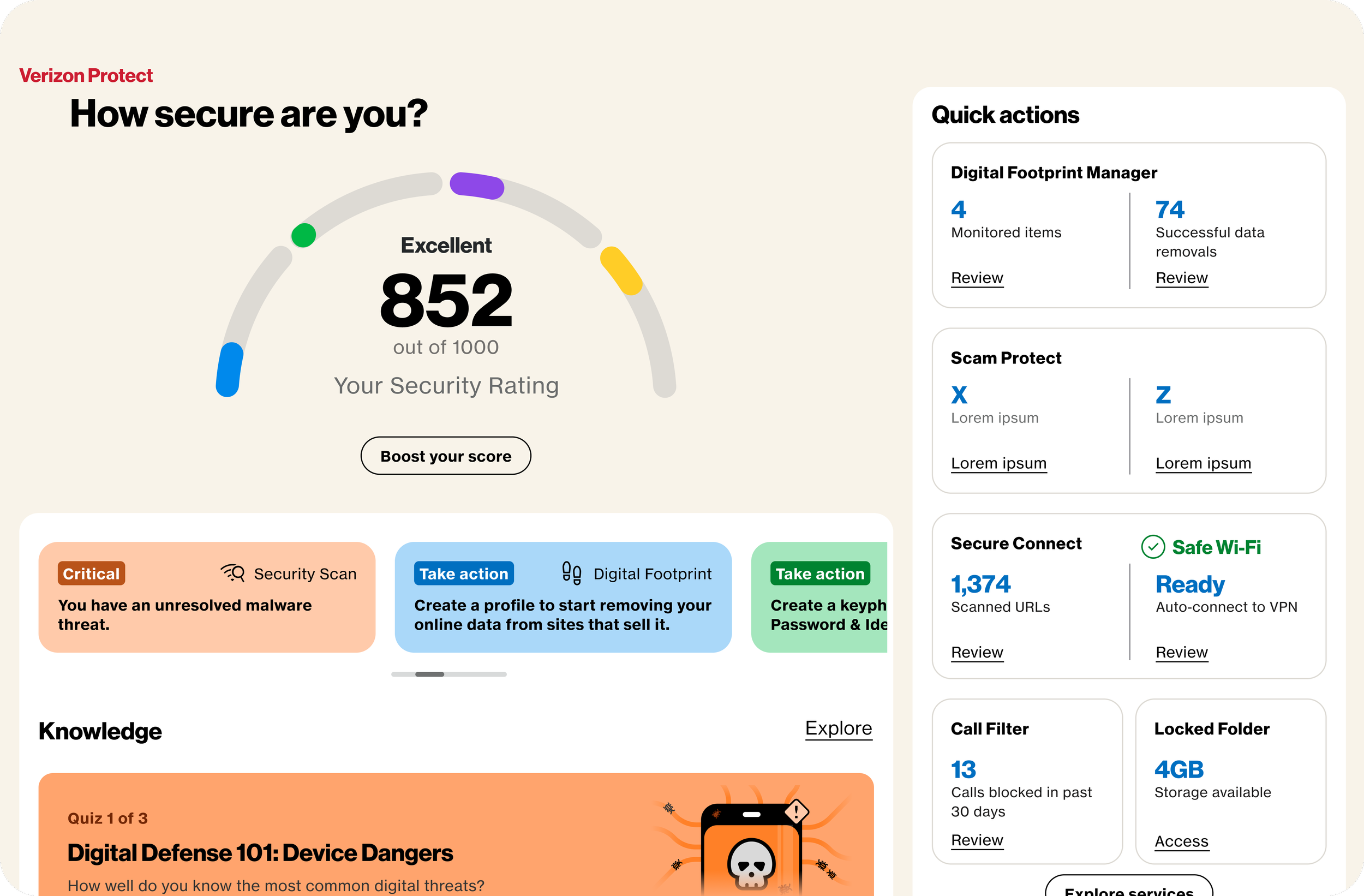
At the same time, the homepage lacked prioritization and personalization, making it harder for users to quickly access relevant actions or understand their account at a glance. The design needed to be clear, modern, engaging, and easy to understand, which, for the amount and complexity of information we had to provide, was a fun challenge to tackle.
Task:
As a Senior UX Designer, I was responsible for:
Defining a tablet-first experience that felt intentional, not stretched
Improving clarity, trust, and usability within Call Filter
Align the new requests with the existing tools, simplifying and producing an efficient solution to be integrated
Exploring and proposing a new homepage concept aligned with user needs and business goals
Collaborating across product, engineering, and stakeholders to align on direction and feasibility
Driving design decisions from concept through validation and iteration
Present to the Client and Development team, from concept to final solution
Action:
1. Tablet Experience Redesign
Audited existing mobile patterns and identified where they failed on larger screens
Defined layout principles specific to tablet, focusing on hierarchy, spacing, and multi-column structures
Introduced scalable components that preserved usability while increasing information density
Worked closely with engineering to ensure designs were feasible within platform constraints
2. Call Filter Improvements
Analyzed user pain points around trust, transparency, and control
Simplified the information architecture to make call categories and actions easier to understand
Redesigned key flows to clearly communicate what is being filtered and why
Introduced clearer feedback and status indicators to increase user confidence
3. Homepage Concept Exploration
Reframed the homepage as a decision hub rather than a static dashboard
Prioritized content based on user intent, frequency of actions, and business priorities
Explored personalization opportunities to surface relevant information dynamically
Created multiple concept directions and facilitated stakeholder discussions to align on vision
Throughout the project, I facilitated design reviews, incorporated cross-functional feedback, and iterated based on both user needs and technical realities.
Result:
During the year I worked for the Verizon client, I had many different projects within the Protect app. I delivered a scalable tablet design approach that elevated the experience beyond simple mobile adaptation, that the client was very happy about.
Improved clarity and usability in Call Filter, making core features easier to understand and interact with. The integration of this product within the Protect app was a very important business mark, and it was achieved very sucessfully.
Established a strong conceptual direction for the homepage, influencing future product thinking. Being the first screen the user interacts with, this complex set of information went through various stages of conceptualization, resulting in a clear, structured, modern-looking, easy-to-use screen.
Strengthened alignment across teams by clearly communicating design rationale and tradeoffs. Contributed to a more cohesive and user-centered experience across key Verizon touchpoints.